An easy framework for your calls to action
(This originally appeared in my newsletter. Sign up now to get content like this, for free, every Monday.)
Your call to action is important because it's the the make-or-break point. It's where people make a decision about whether they're going to take the next step in your sales process, or not.
The stakes are high. If you pair persuasive copy with a crappy call to action, you're going to lose a good portion of people who were otherwise convinced.
The good news is, calls to action aren't that complicated. It's just a matter of getting a few things right.
Take a look at this two-minute video to see an example of these fundamentals in action. Or, if you can't be bothered watching a video, just keep scrolling - I've written out the main points down below.
OK, you're still here. Here's how to write an effective call to action:
(I'm going to call it a CTA for the rest of this, because I cannot be bothered writing out "call to action" a million times.)
Be specific about what is going to happen
I know that I bang on about being specific all the time, but it really is critical.
Let's say you are driving people to schedule demos of your product with your sales team. You could write "get started." Or you could write "schedule a demo".
Which one is more persuasive?
I think "schedule a demo" is more persuasive because it is crystal-clear about what is going to happen next. A vague "learn more" or "get started" is not as compelling because I don't know what is going to happen when I click that button. Will I have to fill out a form? Is it going to take me to a video? Is it a free trial? It's all a bit too hard - and I'm probably going to just go do something else (or go to a competitor's website).
So be specific - think about exactly what you're asking people to do, and use that as your CTA's label.
Use microcopy to handle objections
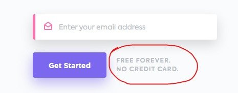
This is microcopy:
The bit circled in red.
(This is from a company called Clickup, who I think did a great job of this).
Microcopy is a really good opportunity to quickly handle any objections that might come up. "No credit card" is a good one, because so many SaaS companies demand a credit card in order to start a trial (which then puts the onus on the user to cancel the subscription).
It's a really low-cost way to just quickly address any issues that might stop people from getting over that final hurdle - so use it!
Keep people engaged in your process
Once someone has clicked your call to action, they have made a very clear decision: they want to take the next step in your sales process.
Once they've done this, you really want to keep them engaged.
Here's an example: let's say you have a lead magnet. An e-book, guide, something like that that someone has to give up their contact details in order to get.
In a circumstance like this, you should make that lead magnet available immediately. Don't set up some system where it gets emailed to them. Give it to them immediately.
Demo requests are another good example. These are a little trickier because they're a matter of coordinating schedules - but what about software like Calendly? If you give someone the ability to book their demo right now, rather than wait to be contacted, you'll keep them much more engaged. Otherwise, it might be hours or days later when the sales rep gets in touch - by which time they might have lost interest altogether.
Wrap it up
So there's really not much to calls to action - just a few basic boxes to tick:
Be specific
Use the microcopy to handle objections
Keep people engaged after they click for as long as humanly possible
Make sure you tick them, because they can make the difference between someone buying your product and losing interest and navigating away.
See you next week
Sam
PS: I'm going to work through an example of a home page with a less-good call to action next week, but if you just can't get enough of CTA chat, you can take a look at the video I'm going to discuss. It's on Linkedin. Leave a comment.
PPS: Are your call to actions (and the other bits of of your home page) perfect? I bet they aren't. Book a home page review and I'll find easy ways to make your home page more persuasive and compelling by this time next week. Costs $799. Find out more and book here.
If you like what you just read, you can get content like this delivered straight to your inbox at 7am every Monday. Sign up now.

